Vernissage Branding 2024
Branding, Poster Design (2024)

Project Description
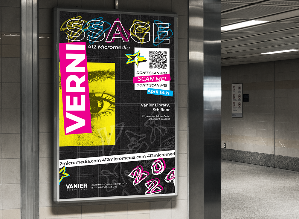
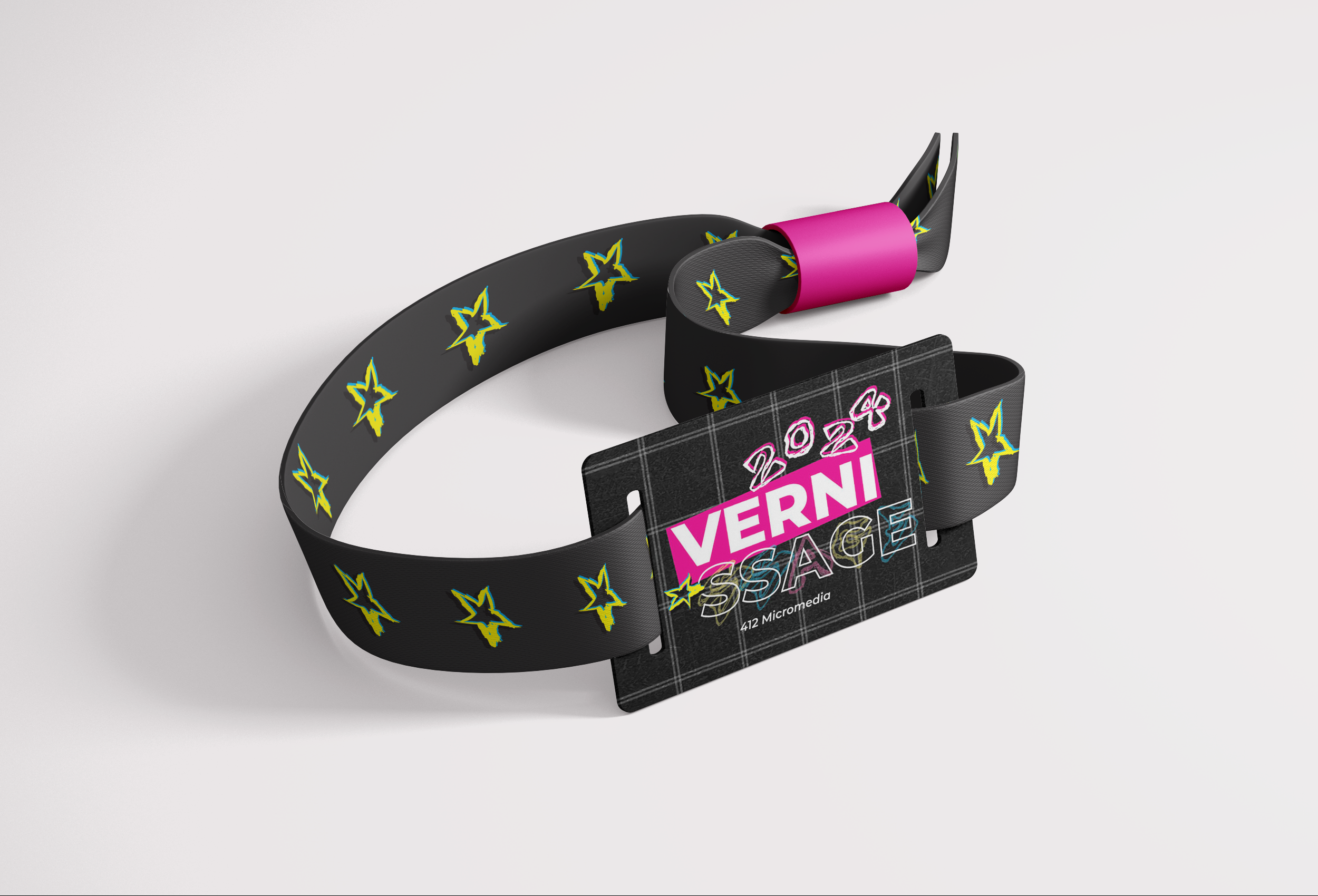
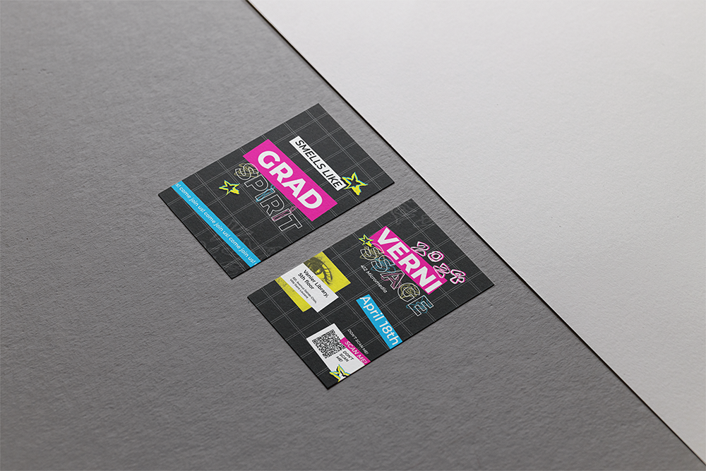
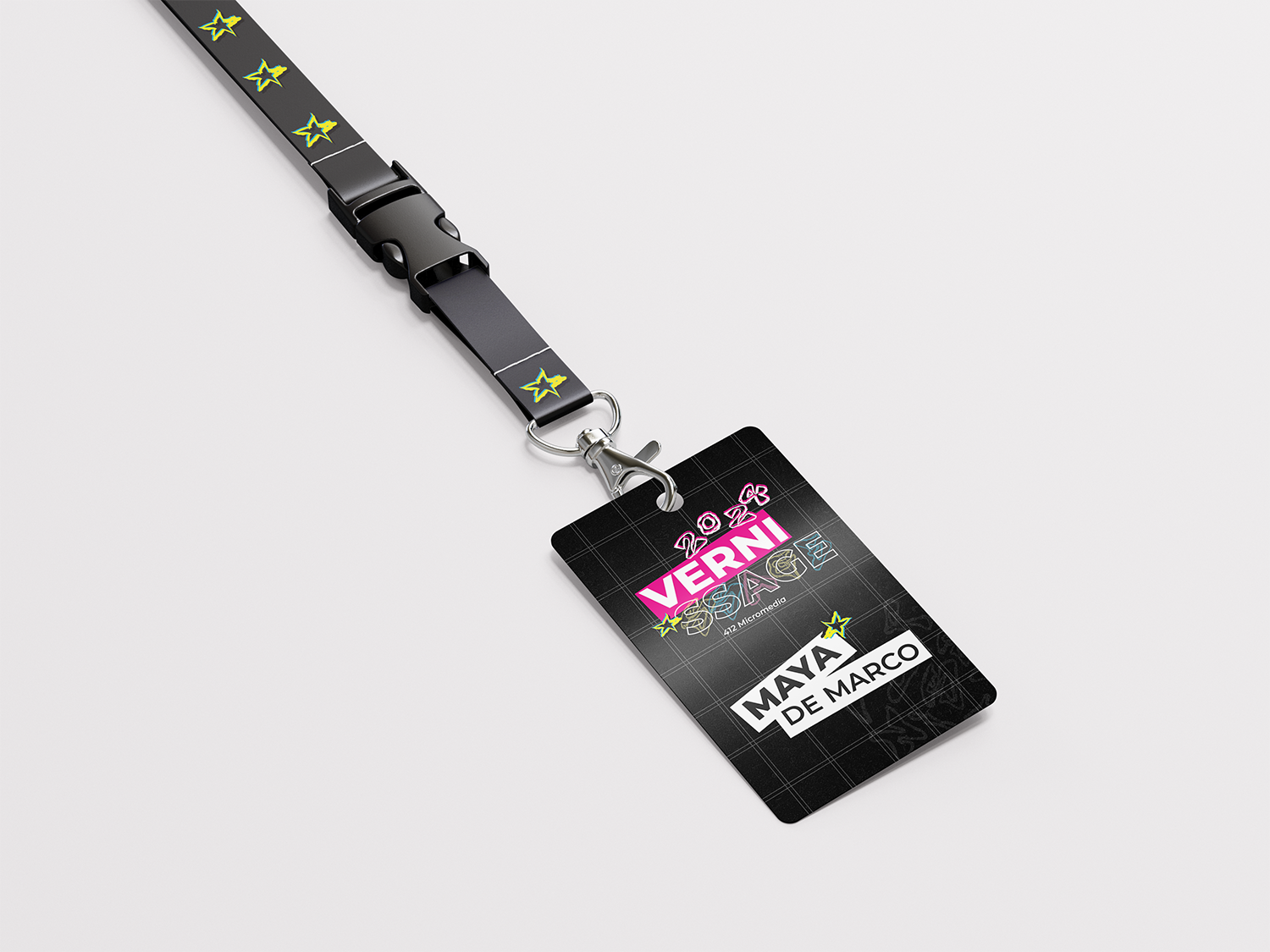
This was a branding project for my college program’s graduation vernissage. I created various promotional materials for print and web.
Project Details
- Tools:InDesign, Illustrator, Photoshop
- Poster: Download!
Challenge
To create promotional materials for an event. To base the design on a brand guide. To create an engaging design for the target audience. To efficiently layout all information necessary. To adapt a design to various formats and promotional materials.
Solution
For creating an attention-grabbing poster and complementary event materials, I opted for a design featuring bold colour contrasts derived from the project’s brand guide. I incorporated elements of brutalism and anti-design to give the promotional material a distinctive edge. Additionally, I included handwritten and hand-drawn components to authentically reflect the characteristics of our cohort and their personalities. To engage the target audience, I added playful yet purposely confusing elements below the QR code, such as “Don’t Scan Me/Scan Me”. This wordplay acts as a mind game to get people to scan the QR code and aligns with the anti-design aesthetic.


