Don't Let It Tear You Down
PSA Campaign (2023)

Project Description
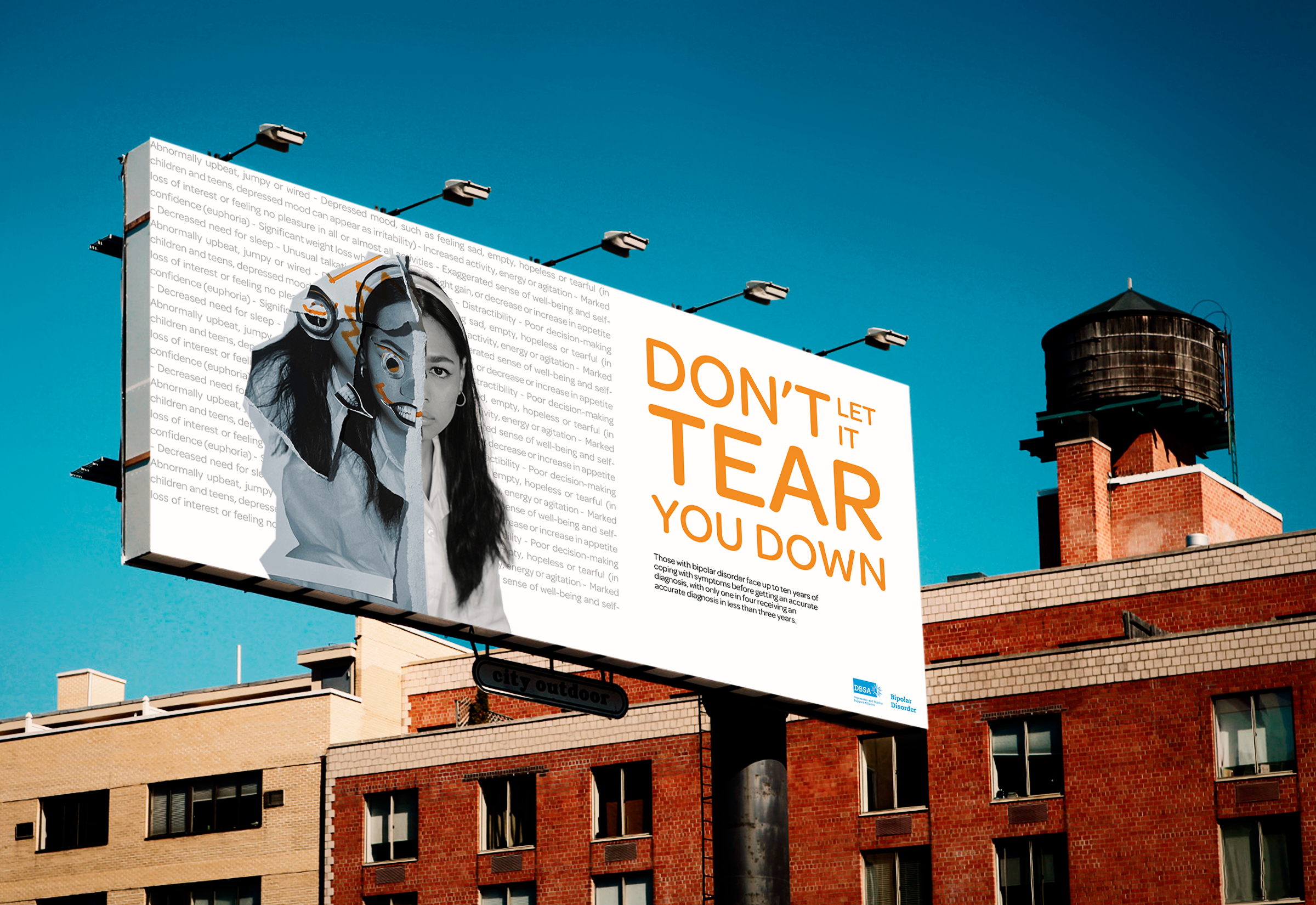
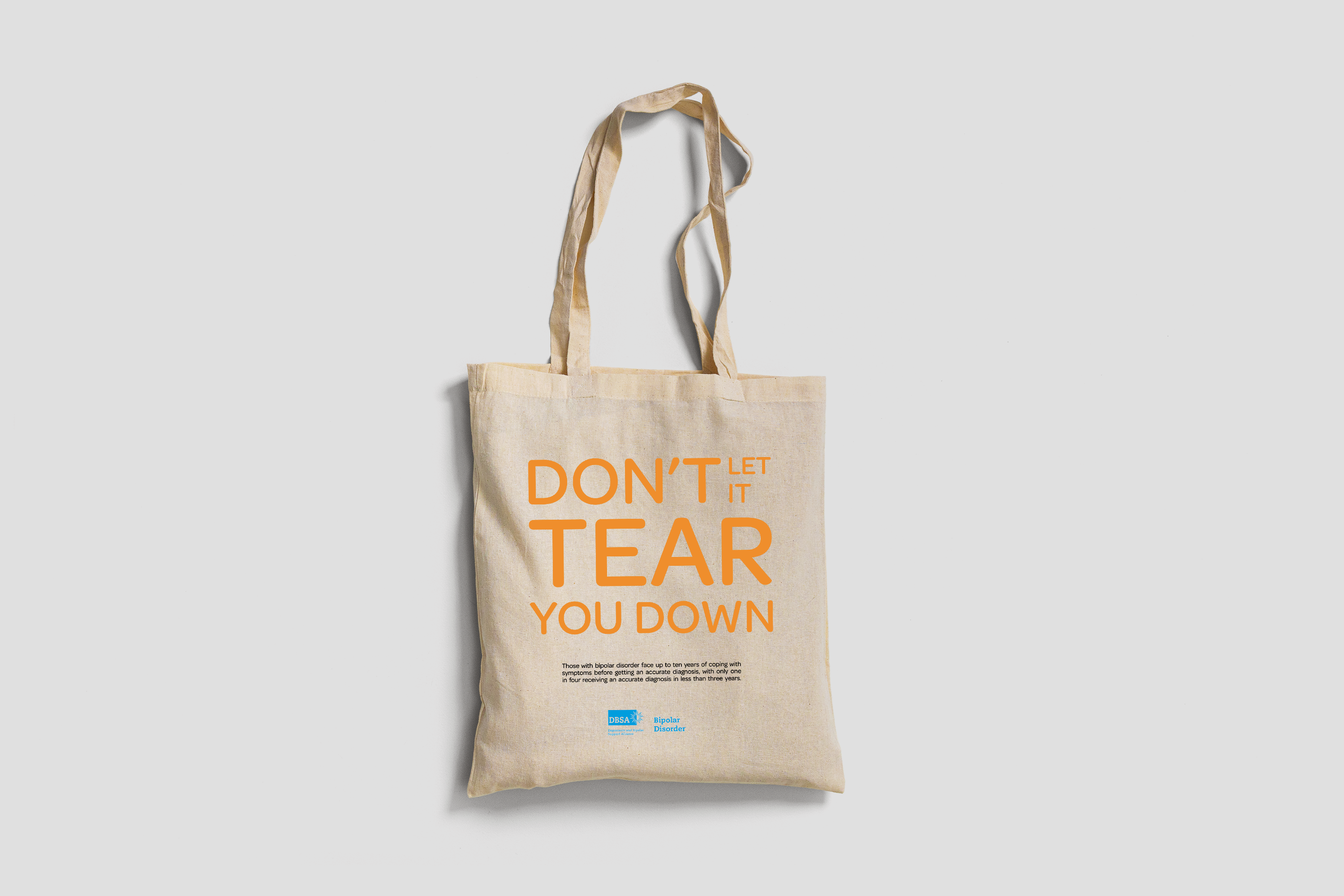
This is a Public Service Announcement Campaign (PSA) named: “Don’t Let It Tear You Down”. This slogan ties into the symptoms that can be seen behind the subject, as they are tearing them down, connecting them to the statistic shown in the visuals for the campaign.
Project Details
- Tools: Illustrator, Photoshop, InDesign
- Format/Size: Various
Challenge
To create a campaign for the Depression and Bipolar Support Alliance (DBSA) to raise awareness for bipolar disorder (BPD) and inform people on the signs and symptoms. This campaign also informs people on when and where to seek help.
Solution
To represent BPD, I used a specific colour palette consisting of black, white, blue, and orange. Black and white are the official colours for BPD as they show the two extremes. Similarly, I used blue and orange, complementary colours, to reinforce the concept of duality. The combination of these neutral and bright colours represent the dull vs the manic side. There are three versions with different portraits such as a woman, a man and a child to create some diversity and representation. The visuals for this campaign were also adapted in a dozen different formats for print and digital deployment.

Materials, Process & Symbolism
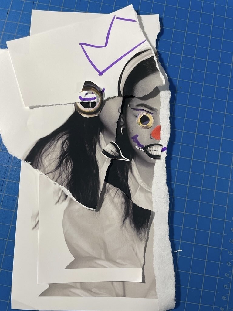
I created a mixed media project by combining a portrait image of a girl with other images such as a fish eye, monster mouth, and clown nose. These added whacky elements were intended to make the manic side of BPD stand out. The paper tear is used to represent how BPD and its symptoms can “tear a person down” and it is ripped at the half mark to play on the duality in the word “bi”polar.
The more closed off and dull side of BPD is represented by the other half of the girl that is in black and white. I repeated this same process and technique for the two other subjects in the campaign.


