Pasitea
Branding, Packaging (2023)
Project Description
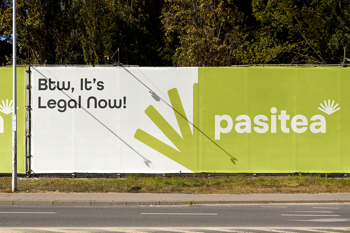
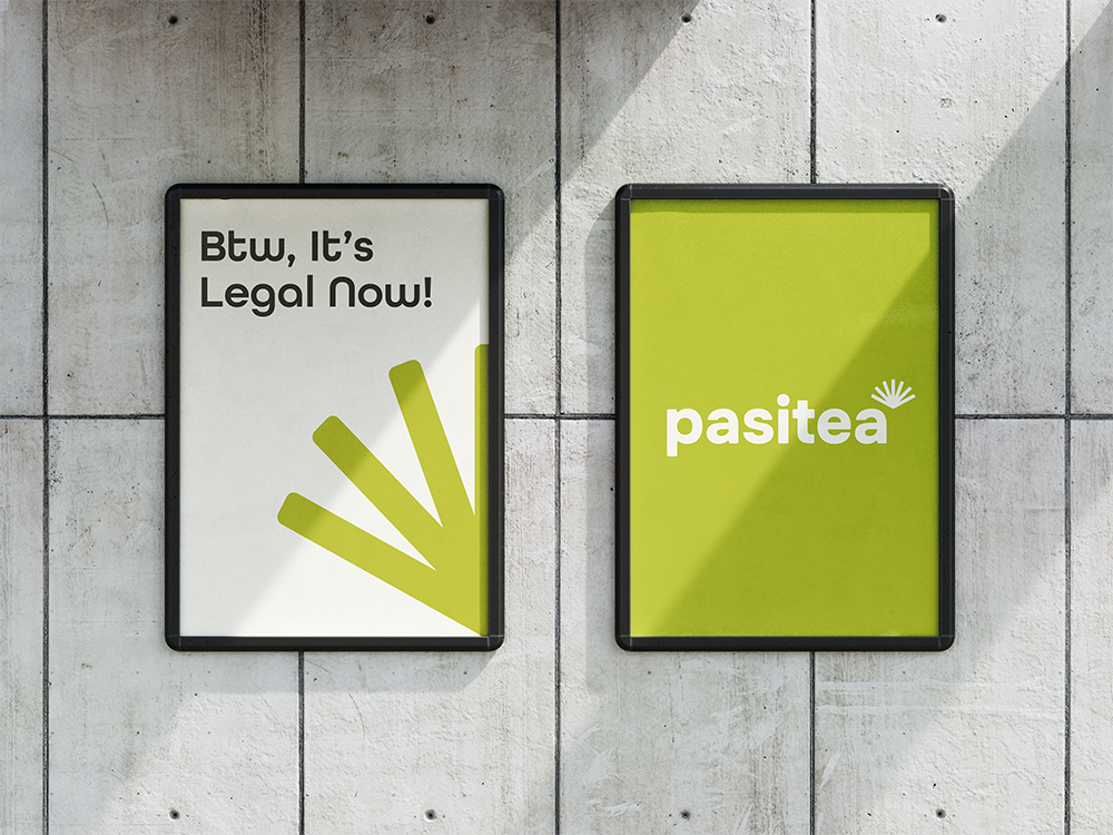
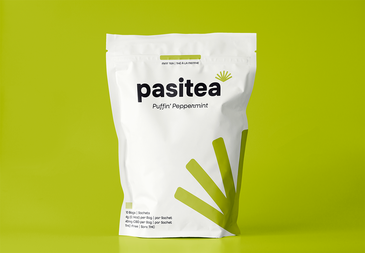
Pasitea is a Montreal based CBD-infused tea brand that promotes relaxation and wellness. This was a branding, packaging, and logo design project.
Project Details
- Tools: Illustrator, InDesign, Photoshop, After Effects
- Brand Guide: Download!
Challenge
To create a brand and come up with a name for the brand. To design a logo that encapsulates the brand essence and values. To design different communications using the brand elements and deploy them through different applications and formats.
Solution
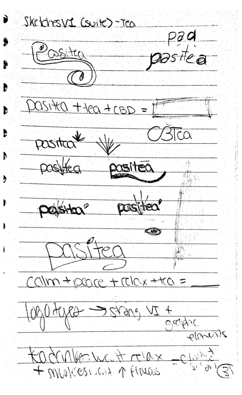
I brainstormed concepts, values, and keywords to shape the brand, facilitating the discovery of a fitting name and visual elements aligned with the brand’s mission, vision, and values. Additionally, I crafted a brand guide to ensure consistent deployment, representing the brand image and core aspects.

Brand Guide
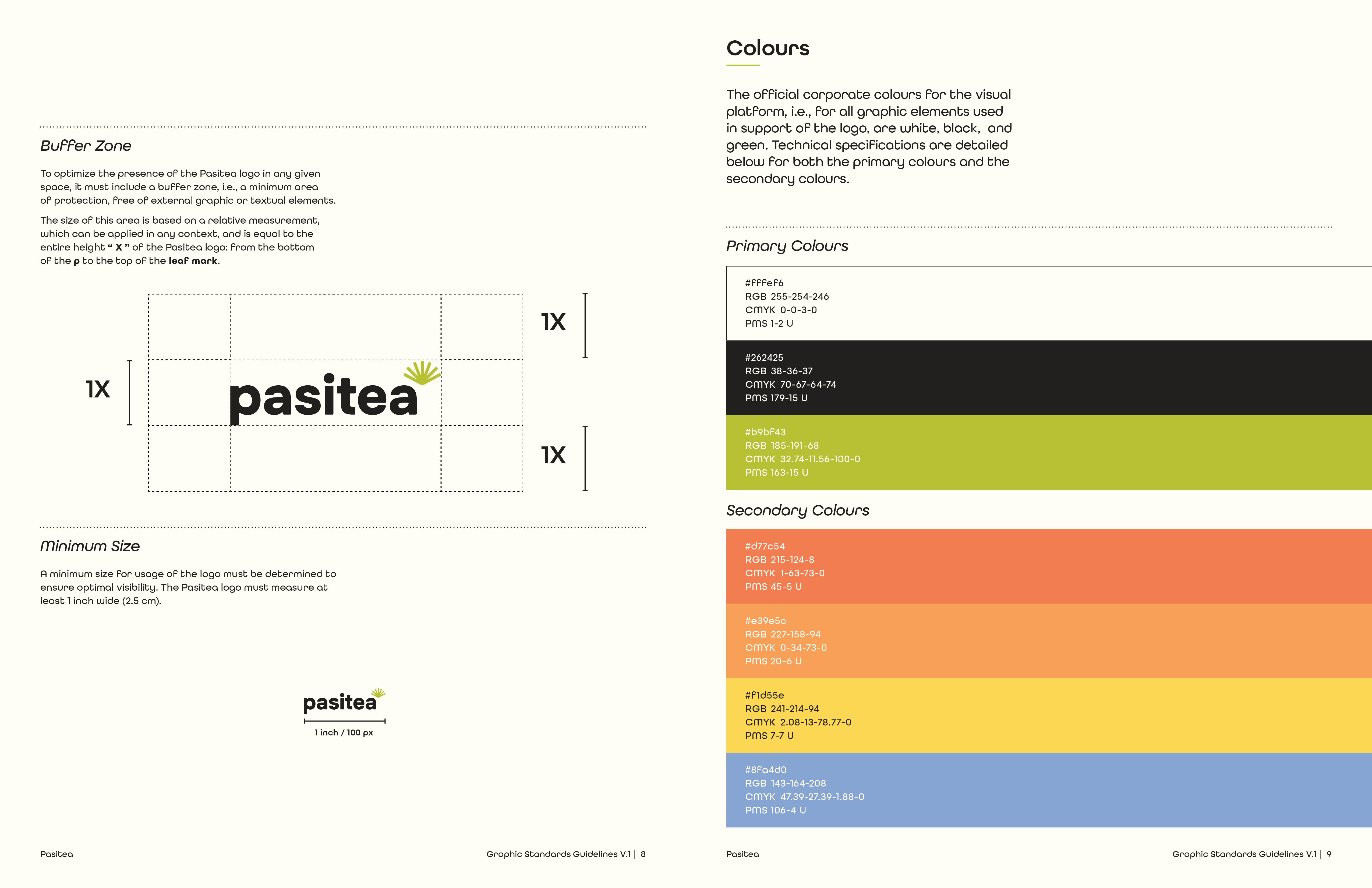
The detailed brand guide that I’ve created for Pasitea, ensures clarity and representation of the company’s visual identity. It covers the brand’s mission, vision, values, and personality. The guide also includes logo usage instructions for readability and consistency across visual communications, along with guidelines for typography, colours, visual elements, and tone of voice.
Colour Palette
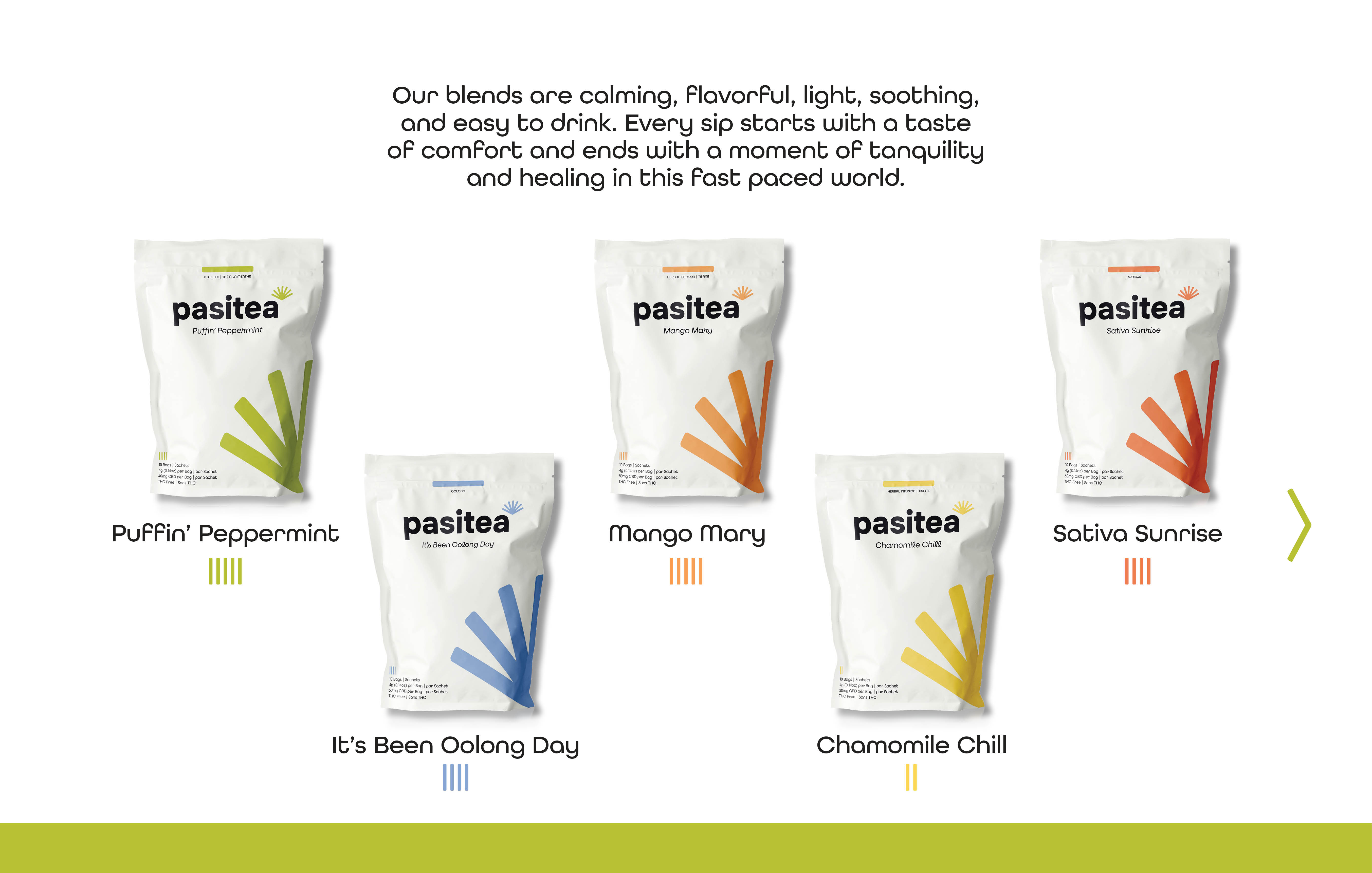
The chosen vibrant and bright colour palette aims to energize and attract consumers, ensuring visibility on crowded shelves. The main colours—off white, black, and green—represent freshness, naturalness, health, and peacefulness. Secondary colours like red, orange, yellow, and blue help differentiate tea types and flavors for quick consumer recognition.
Fonts
I chose All Round Gothic and Neulis Cursive as brand fonts for their rounded properties, which impart a soft, calm, and friendly aesthetic that aligns seamlessly with the brand’s personality.

